How do you design a chatbot that truly works for your users? One that helps instead of frustrates? Our insights from various projects in five do's and don'ts.
Chatbots
They're everywhere. Yet, simply adding a chatbot is rarely enough for a good user experience, and they're often implemented incorrectly. A chatbot also requires a well-thought-out interface. Without the right design, placement, or guidance, functionality can fall short.
Carmel Papa
UX Research & Design"While a chat conversation may seem intuitive, it's not always the most suitable interface for every task or audience.".
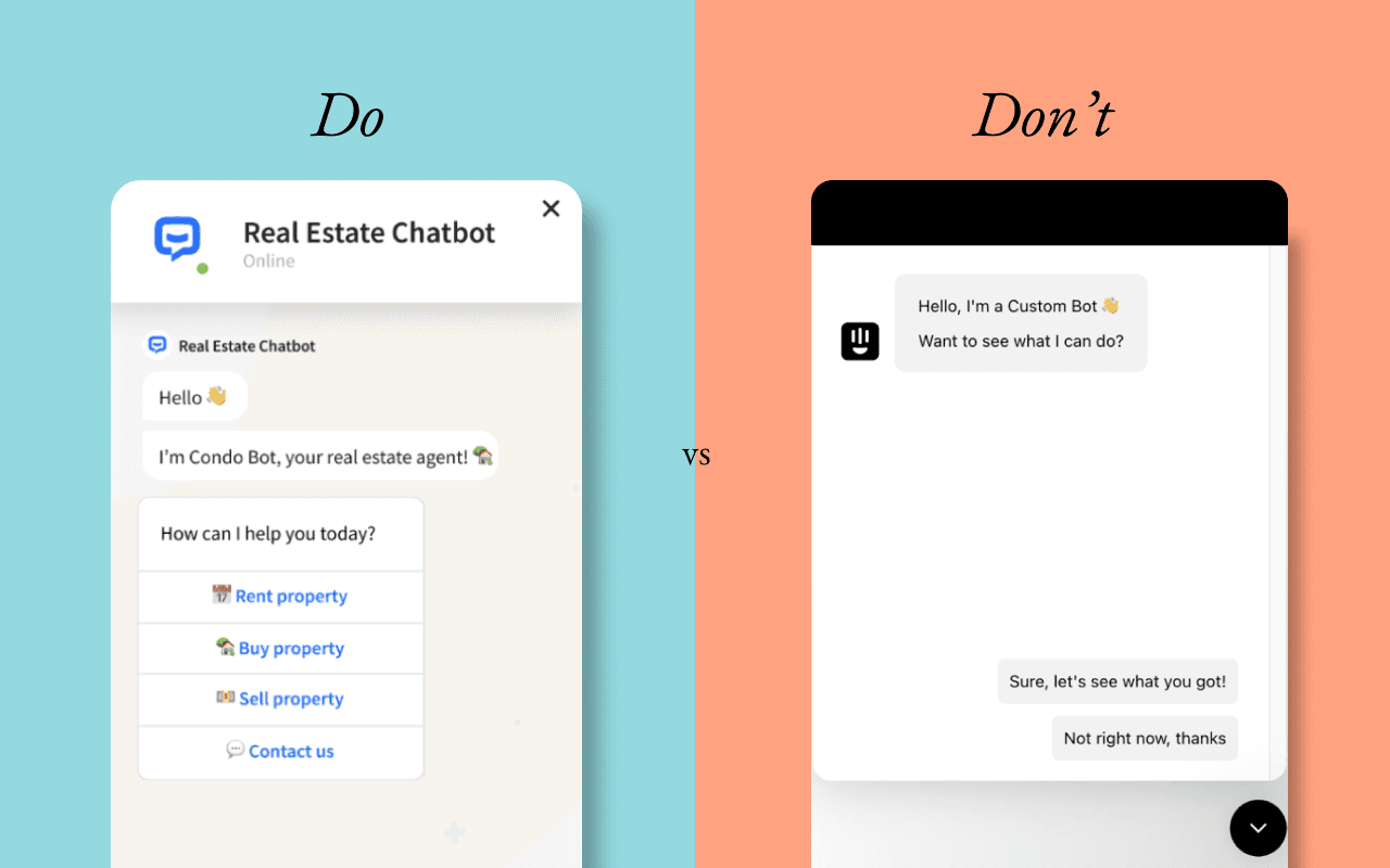
Provide the user with relevant, predefined choices
Limiting choices reduces cognitive load, speeds up decision-making, and facilitates smoother interaction. It also provides a clearer picture of what's possible, manages expectations, and reduces guesswork.
Do:
Help users act faster by immediately presenting common or desired options. This is especially true if the answers are predictable, such as "yes," "no," or a slider when asking for a "score."
Don't:
Don't use predefined options if open-ended input is clearly more appropriate. For example, asking "What's your favorite book?" and providing only three predefined titles limits their ability to express themselves, and that can be frustrating.
Be transparent, avoid assumptions or overpromises
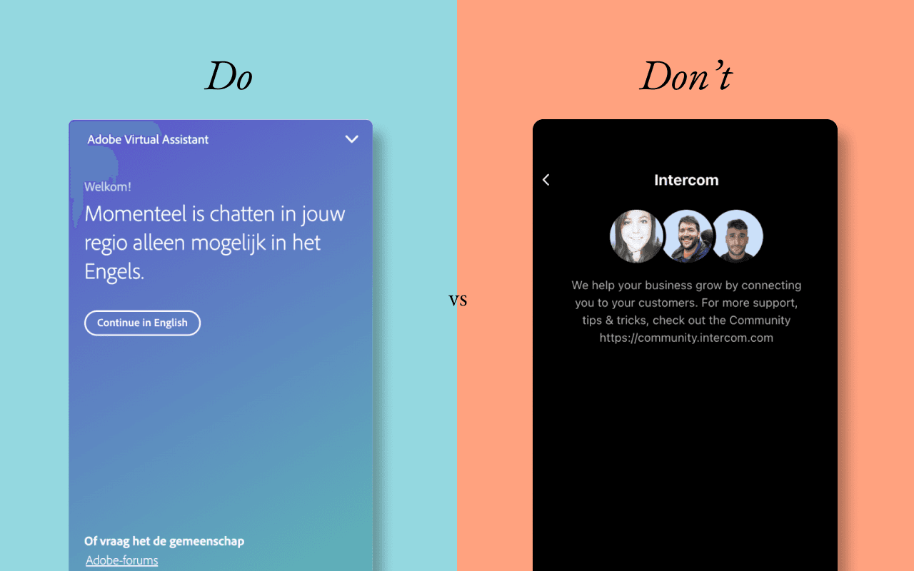
This helps build trust and prevent frustration. Only show features that are relevant and useful in the context of the moment.
If the chatbot can't help, provide a meaningful alternative so the user knows what to do next and isn't left unsure.
Do:
Set clear expectations by demonstrating what your chatbot can and cannot do. Are there any limitations? Communicate them directly and transparently.
Don't:
Don't make promises you can't keep. For example, don't have your support bot say, "We'll respond immediately" if there's a wait time. Users will feel misled and lose trust. Using human faces in a chatbot can also be confusing, as it suggests there's a real person on the other end.
Level with your user and design for real conversations
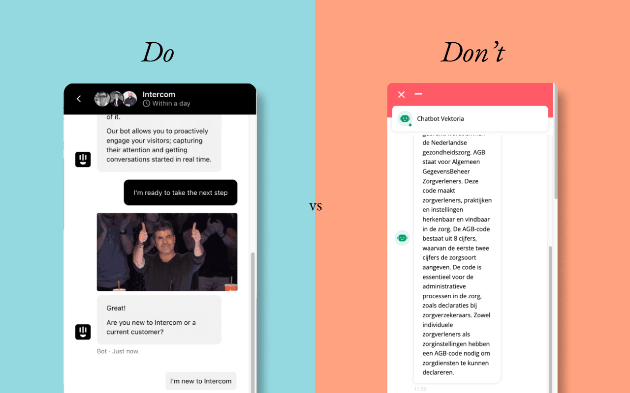
Do
- Design chatbot and UI text as if you were having a natural conversation. Use real-time indicators like "typing..." to show activity, and add short delays in messages so users have time to read and respond.
- Allow users to pause, retry, or start over as needed. Save conversation history so returning users can pick up where they left off or restart with a "Start Over" option.
- Tailor the tone and voice of your chatbot to your audience to build trust and personality. Consider using emojis or GIFs if that fits your brand..
Don't
Don't send multiple messages at once. For example, five lines of script in a row without a pause feels robotic and overwhelming, causing users to tune out.
Make accessibility a priority in conversations
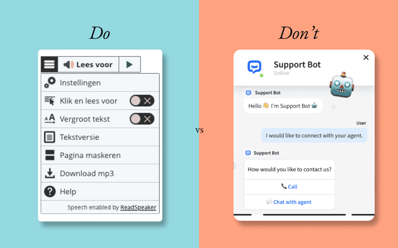
Do
Design your interface with diverse user needs in mind. Enable text enlargement, support screen readers, and offer narration functionality. Provide sufficient white space and contrast to improve readability. Make chatbot interactions keyboard-accessible and compatible with assistive technologies.
Don't
Don't rely solely on visual elements or animations to convey meaning.
For example, a typing GIF without accompanying text can be confusing for people who use screen readers or have cognitive disabilities.
Don't overload your user
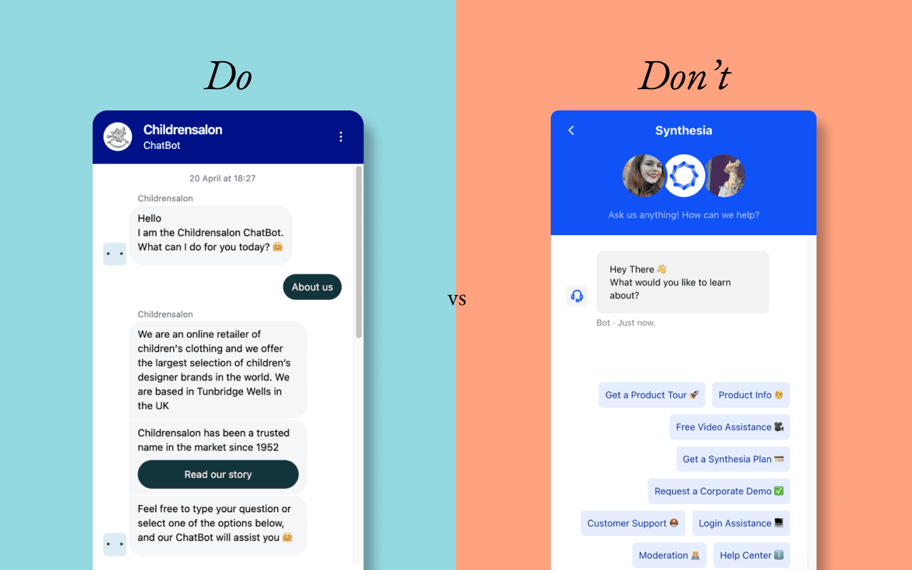
Do
Present information in small, scannable chunks. Break up longer texts into multiple chat bubbles or screens.
Keep each call to action (CTA) focused and relevant to the user's current activity. A simple proposal or suggestion as a starting point increases engagement. Users respond more quickly when the system takes the first step.
Don't
Don't overwhelm users with a wall of text or too much information. Displaying an entire FAQ in a single narrow column or offering six options simultaneously, for example, creates friction. It overwhelms users, reduces comprehension, and increases the chance of abandonment.
Let's get started!
Ready to take your user interaction to the next level?